
Most business owners think a logo is where their brand starts. It's actually where it ends up.
The logo is the surface. Underneath it sits your strategy, your positioning, your personality, your promise – the thinking that tells a designer what the logo needs to say before a single shape is drawn. Skip that thinking and you get a logo that looks fine but does nothing. That's why so many DIY logos fail – not because of poor design skills, but because the strategic foundation wasn't there to design from.
Here's a question worth sitting with before we go any further: if your logo disappeared tomorrow, what feeling would your customers miss?
If you can answer that – and explain why – you understand what a logo is actually for. If you can't, you might have a logo, but you don't yet have a brand.
Why your business needs a logo
A logo does several jobs simultaneously, and it needs to do all of them without explanation.
It creates a strong, memorable identity – the thing that makes a customer recognise you on a crowded shelf, a busy feed, or a street full of signage. It conveys your values, personality and professionalism before a single word is read, building the kind of first impression that either earns trust or loses it.
It differentiates you. In a market where your competitors do roughly what you do, your logo is often the first signal that you're different – and worth a second look.
It needs to be flexible enough to live everywhere. A website header, a business card, a social media profile, a van, a pen, a billboard. Every single one of those applications is a moment where your brand either shows up consistently or it doesn't. Inconsistency costs you trust faster than almost anything else.
And over time, a well-designed logo contributes to something more valuable than recognition – loyalty. Customers return to brands they recognise and trust. A logo that earns that trust becomes one of the most valuable assets your business owns.
5 commandments you need to embrace to make a great logo
Commandment 1: Thou logo must be simple
Your logo doesn't get time to be understood. It only gets time to be recognised.
In the real world, nobody is studying your logo. They're scrolling past it, driving by it, glancing at it on a small screen while doing something else entirely. The job of the logo isn't to explain everything about your brand. It's to create an instant sense of familiarity.
If it's too detailed, too clever, or trying to say too much, the brain skips it. Not because people are unintelligent – because they're efficient.
Think of your logo like a road sign, not a brochure. A road sign works because you recognise it instantly, you don't have to decode it, and you can recall it later without effort. That's what simplicity gives you – not just a cleaner look, but faster memory.
If it needs explaining, it's already too complicated. That one line tends to shift the conversation from "can we add more?" to "what can we remove?" – which is where the real work happens.

Apple's logo has changed form and colour over 46 years but has never tried to say too much. That's not a coincidence.
Commandment 2: Thou logo must be memorable – for the right reasons
Memorability on its own is easy. You can be remembered for being confusing, awkward, cheap-looking, or unintentionally suggestive. That's not a branding win. That's a distraction.
The real question isn't "will people remember this?" It's "does this logo reinforce the story you're trying to tell, or does it accidentally create a different one?"
There are a few ways this goes wrong. Someone chases a clever visual concept and the gimmick becomes the main event – people remember the idea, not the business. Or the logo says one thing while the business does another: a premium service with a playful, DIY-looking mark. A warm, people-first brand that feels cold and corporate. People remember the disconnect.
Then there's accidental symbolism. Shapes, spacing, or negative space that unintentionally suggest something else. Once seen, it can't be unseen – and that becomes the story. It's also why a good designer will always check that a logo doesn't carry meaning you never intended.
The quiet question we ask when reviewing any logo concept is: what will people repeat about this when you're not in the room? If the answer is "they feel premium and considered" – you're on track. If it's "their logo looks a bit like..." – you've lost control of the narrative.
Being memorable isn't the goal. Being remembered correctly is.
Commandment 3: Thou logo must be timeless
Trends aren't necessarily bad. But they come with an expiry date.
When a client wants to chase a design trend, the question I ask is: are we choosing this because it expresses your brand, or because it's quickly recognised right now? Because those are two very different reasons – and only one of them will still be working in ten years.
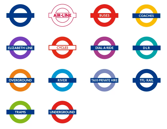
The London Underground roundel is the proof. A red circle, a blue horizontal bar, the word Underground. It still works because it never followed a trend. It solved a problem: be instantly recognisable, easy to reproduce, and impossible to confuse with anything else. That's it. No flourishes, no era-specific styling, no clever concept that needed explaining.
Instead of asking whether a logo feels modern, I ask clients whether it would still feel like them when the trend moved on. That shifts the conversation from chasing relevance to building recognition.
Design for recognition, not relevance. Relevance fades. Recognition compounds.
Read all about the history at the London Transport Museum.
Commandment 4: Thou Logo Must Be a Chameleon
A logo doesn't fail because it looks wrong. It fails because it stops being itself when it leaves ideal conditions.
The breaking point is almost always a small moment. A favicon. An email signature. A profile picture crowded next to a dozen others. Not a dramatic failure – just a quiet one. The logo was designed for one scenario, in a controlled environment, and nobody thought to test it anywhere else.
When this happens, the cause is usually the same. The logo only works at full size – fine lines disappear, details blur, meaning gets lost when scaled down. Or it depends on context to make sense, only clicking when someone is told what it is. Or there's no hierarchy of forms – everything equally important, so nothing survives simplification.
Real life isn't a pristine mockup. It's compression, cropping, low resolution, bad lighting, and awkward placements next to competitors. A logo needs to hold its identity through all of it.
The test we use is simple: does this still look like us when it's reduced to its simplest possible version? If the answer is no, everything else is decoration.
This is why brand guidelines matter – they plot out every scenario in advance, so the logo is never encountering a situation it wasn't prepared for.
If your logo can't survive being tiny, it won't survive being everywhere.
Commandment 5: Thou Logo Must Be Appropriate
The real test of appropriateness isn't whether a logo offends anyone. It's whether it belongs.
Every audience already has a mental library of what "normal" looks like in their category – what a law firm should feel like, what a children's brand should feel like, what a luxury jewellery brand should feel like, what a trade service should feel like. If your logo sits outside that expectation without intention, it doesn't feel bold. It feels wrong.
This shows up in a few ways. An emotional mismatch – a serious service that feels playful, or a warm brand that feels cold and corporate. A context mismatch – it looks great in isolation but doesn't belong on an invoice, a uniform, or a shopfront. An audience mismatch – it signals to the wrong person entirely. Or a category misalignment – ignoring the unspoken rules of an industry. You can break those rules, but you need to understand them first. Otherwise it looks like you didn't know they existed.
The jewellery versus law firm example makes it clear. A sleek, sensual mark might be entirely appropriate for a confident, aspirational audience. Put that same energy into a law firm or a children's brand and it collapses trust immediately – even if nothing is visually wrong with it.
And yes, sometimes ignoring form too loosely takes you somewhere worse: unintentional symbolism, ambiguous shapes, things that don't pass the second-opinion test with real humans. Not because designers are careless, but because they've prioritised cleverness over clarity.
The question we ask is simple: does this feel like it belongs in the same room as your customer? If the answer is yes, you're close. If it feels like it belongs somewhere else entirely – even if it looks good on its own – it's not appropriate yet.
A logo isn't just designed to represent your brand. It's designed to belong in your customer's world. If you need someone to design yours properly, here's how we approach identity design.
Frequently Asked Questions
Why do I need a logo?
A logo builds trust, brand recognition, and professionalism. It forms part of your broader brand identity, conveying your values and personality at a glance. It differentiates you from competitors and gives customers something to remember.
What makes a good logo?
A good logo is simple, memorable, versatile, and relevant to your brand. It should work at any size, in colour and black and white, and communicate your brand essence without needing explanation. A fantastic logo will always tie the identity together!
Can I design my own logo?
You can, but a professionally designed logo needs strategic foundations underneath it first – your positioning, personality and audience clarity. Without those, even a professionally designed logo is guesswork. If you're not sure where to start, a brand audit will tell you what you actually need before you spend anything on design. When you're ready to build the full identity, our branding service covers strategy and visual identity together.


